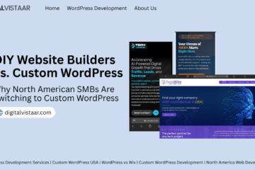

Introduction: Traffic Is Not the Problem. Your WordPress Design Is.
Here is a reality that most business owners discover too late:
Getting people to your website is not the hard part anymore.
Between Google Ads, SEO, social media, email campaigns, and word-of-mouth referrals, driving traffic to a WordPress website has never been more achievable. What remains brutally difficult — and almost always overlooked — is what happens after someone lands on your site.
Do they stay? Do they scroll? Do they trust you? Do they reach out?
Or do they leave within eight seconds, never to return?
If your WordPress website is pulling in decent traffic but your lead generation numbers look flat, stagnant, or frankly embarrassing, the problem is almost certainly not your product, your pricing, or your marketing strategy. The problem is hiding in plain sight inside your WordPress design itself.
Across hundreds of small and medium-sized business websites in the USA and Canada, the same five design mistakes appear again and again — silently strangling conversion rates while founders pour more budget into ad spend, SEO campaigns, and content marketing that sends people to a website that was never built to convert them.
This blog breaks down each of those five critical WordPress design mistakes, explains exactly why they kill lead generation, and shows you what the top-converting WordPress websites in North America do differently. Let’s get into it.
Mistake #1: No Clear Value Proposition Above the Fold
What Most WordPress Websites Do
You’ve got three to five seconds — maybe less on mobile — before a new visitor makes a subconscious decision about whether to stay on your WordPress website or hit the back button. In those critical first moments, most business websites waste their above-the-fold real estate on:
- A generic hero image of a handshake, a happy team photo, or a skyline
- A vague headline like “Welcome to [Business Name]” or “Solutions for Your Success”
- A wall of company history text that nobody asked for
- A beautiful slider that auto-rotates through three messages the visitor never reads
Meanwhile, the visitor is asking one fundamental question that your WordPress homepage design isn’t answering:
“What exactly do you do, and why should I care?”
If your above-the-fold section doesn’t answer that question in under five seconds, your visitor is gone — and your lead generation numbers suffer for it.
What Top-Converting WordPress Sites Do Differently
The highest-converting WordPress websites treat their above-the-fold section as premium billboard space on the busiest highway in their city. Every word, every image, every button earns its place by answering the visitor’s core question immediately and compellingly.
A conversion-optimized WordPress hero section contains exactly four elements:
1. A benefit-driven headline — not what you do, but what your customer gains. “Get a Custom WordPress Website That Generates Leads on Autopilot” beats “We Build Websites” every single time.
2. A supporting subheadline — one sentence that adds specificity. “Serving small and medium businesses across the USA and Canada with WordPress development, SEO optimization, and conversion-focused design.”
3. Social proof signal — a trust indicator placed immediately in view. Star ratings, client count, recognizable brand logos, or a short testimonial snippet.
4. One clear primary CTA — a single, unmissable button that tells the visitor exactly what to do next. Not three buttons. Not a dropdown menu. One action.
The research is clear: websites with a strong, specific value proposition above the fold convert at 2x to 3x the rate of sites with generic hero sections. For a WordPress website generating 5,000 monthly visitors, that difference could mean 30 leads per month versus 90 — from the exact same traffic.
Mistake #2: Weak, Buried, or Confusing Calls-to-Action
What Most WordPress Websites Do
This is arguably the most common and most costly WordPress design mistake in lead generation — and it shows up in three distinct ways:
Too many CTAs competing for attention. When every section of your WordPress page has a different button — “Learn More,” “Get a Quote,” “Download Our Guide,” “Watch the Video,” “Subscribe to Newsletter,” “Contact Us” — visitors experience decision paralysis. Presented with too many choices, they make none.
CTAs that blend into the design. A grey button on a white background. A text link buried in a paragraph. A form hidden at the very bottom of a long page. If your call-to-action doesn’t visually interrupt the reading flow and demand attention, most visitors simply won’t see it.
Vague CTA copy that kills urgency. “Submit.” “Click Here.” “Learn More.” These phrases tell the visitor nothing about what they’ll receive or what happens next. They create friction where there should be momentum.
What Top-Converting WordPress Sites Do Differently
The best-performing WordPress websites in North America treat CTAs as carefully engineered decision points — not design afterthoughts. Here is what separates a high-converting CTA from a dead one:
Specificity over vagueness. “Get My Free WordPress Audit” outperforms “Contact Us” because the visitor knows exactly what they’re getting. “Book a 30-Minute Strategy Call — Free” outperforms “Schedule a Meeting” because it removes ambiguity and quantifies the commitment.
Strategic placement at every decision point. Top-converting WordPress sites place CTAs at the end of every section where a visitor might feel ready to act — after a strong value proposition, after social proof, after a case study, after a pricing table. Never force someone to scroll back up to find the button.
Visual hierarchy that commands attention. The primary CTA button uses the highest-contrast color on the page. It has generous whitespace around it. It is large enough to tap comfortably on mobile. It stands out from the design rather than harmonizing with it.
Urgency and specificity in the copy. “Start Your Free Consultation Today” creates gentle urgency. “Claim Your Free WordPress Design Review — Limited Spots Available” adds scarcity. Both outperform the average CTA copy on most North American business websites.
If your WordPress website’s lead generation strategy lives and dies by its contact form, you need to rethink your CTA architecture from the ground up.
Mistake #3: Slow Page Speed That Bleeds Conversions
What Most WordPress Websites Do
WordPress is the world’s most popular CMS precisely because it is flexible and extendable. But that flexibility comes with a significant risk: plugin bloat, unoptimized themes, and lazy image loading that turns a promising website into a slow-loading conversion killer.
The average WordPress website in 2025 runs between 30 and 60 active plugins. Many of those plugins load additional CSS and JavaScript files on every page — even pages where they’re not needed. Add an unoptimized theme, full-resolution images straight from a camera roll, no caching layer, and shared hosting that can barely handle traffic spikes, and you have the recipe for a WordPress website that loads in 5, 6, or even 8 seconds.
Here is what that page speed is costing your lead generation:
- 53% of mobile users abandon a website that takes longer than three seconds to load
- Every additional second of load time reduces conversions by up to 7%
- Google’s Core Web Vitals directly factor page speed into search rankings — a slow WordPress site ranks lower, receives less organic traffic, and generates fewer leads across the board
For a business owner investing thousands of dollars in WordPress development and SEO services, slow page speed is like filling a bucket with a hole in it.
What Top-Converting WordPress Sites Do Differently
Performance optimization is not an afterthought on high-converting WordPress websites — it is a foundational requirement built into the development process from day one.
Image optimization at every level. Every image is compressed, converted to modern WebP format, properly sized for its display container, and loaded lazily so it only renders when the visitor scrolls near it. This single practice alone can reduce WordPress page weight by 40 to 60 percent.
Premium managed WordPress hosting. The highest-converting North American WordPress sites are hosted on performance-optimized platforms — WP Engine, Kinsta, or Cloudways — not on shared hosting accounts that throttle resources the moment traffic increases. Managed WordPress hosting provides server-level caching, automatic scaling, and CDN integration that generic hosting simply cannot match.
Plugin auditing and elimination. Every plugin that remains active on a WordPress site must justify its performance cost. Top developers regularly audit plugin libraries, deactivate anything redundant, and replace heavy plugins with lightweight code solutions wherever possible.
Caching and CDN implementation. Server-side caching (via W3 Total Cache, WP Rocket, or server-level solutions) stores pre-built versions of pages so the server isn’t regenerating HTML on every visitor request. A Content Delivery Network (CDN) serves static assets from servers physically close to the visitor — critical for businesses serving customers across the geographically large markets of the USA and Canada.
The goal is a WordPress PageSpeed Insights score of 85 or above on both mobile and desktop. Below 70, you are actively losing leads to faster competitors.
Mistake #4: Poor Mobile Experience That Drives Visitors Away
What Most WordPress Websites Do
Here is a statistic that should alarm every business owner running a WordPress website in North America: over 63% of all web traffic in the USA and Canada now comes from mobile devices.
Despite this, the majority of small and medium business WordPress websites are still designed primarily for desktop — with mobile as an afterthought. The signs are everywhere:
- Text that is too small to read without pinching and zooming
- Buttons that are too close together to tap accurately with a thumb
- Navigation menus that collapse into hamburger icons but break when tapped on older devices
- Forms with tiny input fields that trigger aggressive mobile keyboards
- Full-width desktop images that stack awkwardly on a 390px phone screen
- Pop-ups and overlays that cover the entire mobile screen and can’t be dismissed
Each of these mobile design failures creates friction. And friction is the enemy of lead generation.
When a potential customer in Toronto or Chicago pulls up your WordPress website on their iPhone during their commute and immediately struggles to read your content, navigate your menu, or find your contact form — they leave. They don’t give you a second chance. They simply find a competitor whose WordPress website works beautifully on mobile.
What Top-Converting WordPress Sites Do Differently
Mobile-first design is not a trend among the highest-converting WordPress websites in North America — it is the standard. The most effective approach is to design the mobile experience first, then scale up to desktop — not the other way around.
Thumb-friendly tap targets. Every button, link, and form field on a top-converting WordPress website meets Google’s recommended minimum tap target size of 48×48 pixels. There is sufficient spacing between interactive elements to prevent accidental taps.
Mobile-optimized typography. Body text is a minimum of 16px on mobile, with generous line height for readability on smaller screens. Headlines scale proportionally using fluid typography techniques so they never overflow their containers or wrap awkwardly.
Streamlined mobile navigation. The best mobile WordPress navigation is simple, fast, and predictable. A sticky header with a well-implemented hamburger menu, a visible phone number or CTA button, and no more than seven top-level navigation items.
Mobile-specific form design. Lead capture forms on high-converting WordPress sites are designed for mobile completion — with large input fields, appropriate keyboard types (number pad for phone fields, email keyboard for email fields), minimal required fields, and single-column layouts that don’t require horizontal scrolling.
Google’s Mobile-Friendly Test as a baseline. Every page of a top-converting WordPress website passes Google’s Mobile-Friendly Test with no issues — this is the minimum acceptable standard, not an aspirational goal.
If your WordPress website design treats mobile as a secondary consideration, you are building your lead generation strategy on a foundation that ignores the majority of your potential customers.
Mistake #5: Missing or Weak Social Proof Throughout the Site
What Most WordPress Websites Do
Trust is the single most important currency in online lead generation — and most WordPress websites are bankrupt.
Think about the last time you considered hiring a service provider or purchasing from a business you’d never heard of before. What did you look for? Reviews. Testimonials. Case studies. Client logos. Awards. Media mentions. Social proof.
Now look at your WordPress website. Where is yours?
For the majority of small and medium-sized business websites in the USA and Canada, social proof is either completely absent, buried on a dedicated “Testimonials” page that almost nobody visits, or presented so weakly that it fails to build the trust it was designed to create:
- Three testimonials with only first names and no photos or company details
- A star rating widget showing 5.0 from two reviews
- Client logos so small and faded they barely register visually
- Case studies that describe what was done but never show measurable results
- A “Trusted by 500+ clients” claim with zero supporting evidence
Weak social proof is almost worse than no social proof — it raises suspicion rather than building confidence.
What Top-Converting WordPress Sites Do Differently
The highest-converting WordPress websites in North America treat social proof not as a single section to check off a list, but as a continuous trust-building thread woven throughout the entire page experience.
Testimonials with full identity. A conversion-optimized WordPress testimonial includes a real name, a job title, a company name, a recognizable photo, and ideally a specific result. “Sarah Thompson, Marketing Director at Maple Ridge Construction, Toronto — ‘Our leads increased by 340% in the first 90 days after our WordPress redesign.'” That testimonial builds trust. A generic quote from “J.T. — Happy Customer” does not.
Strategic placement at moments of doubt. The highest-converting WordPress sites place social proof immediately before every major conversion point — right above the contact form, directly beneath the pricing section, adjacent to the primary CTA button. Social proof placed at these decision moments answers the subconscious objection “But can I really trust these people?” at the exact moment it arises.
Quantified results, not vague praise. “Working with this team transformed our business” creates a vague positive feeling. “Our WordPress website now generates 47 qualified leads per month — up from 6 when we were on Squarespace” creates a specific, believable, desire-inducing result. Top-converting sites fill their social proof with numbers, percentages, timeframes, and outcomes.
Case studies that tell a story. The most powerful trust-builders on high-converting North American WordPress websites are detailed case studies that follow a clear structure: the problem the client faced, the WordPress solution implemented, and the specific measurable results achieved. These case studies speak directly to prospects who are experiencing the same problem and are searching for a proven solution.
Third-party review integration. Embedding live Google Reviews, Clutch ratings, or Trustpilot widgets directly into a WordPress website provides third-party validated social proof that visitors trust far more than testimonials a business has curated itself.
The Common Thread: Design Without a Conversion Strategy
Looking at all five of these WordPress design mistakes together, a clear pattern emerges.
Each one is the result of building a WordPress website with aesthetics as the primary goal and conversion as an afterthought — or no goal at all.
A beautiful WordPress website that doesn’t convert is not a business asset. It is an expensive digital brochure. And in the competitive online markets of the USA and Canada, an expensive digital brochure that generates zero leads is a liability, not an investment.
The businesses that dominate lead generation in their industries with their WordPress websites share one fundamental characteristic: every design decision is made in service of moving a visitor one step closer to becoming a customer.
Every headline. Every image. Every button color. Every testimonial. Every page load time. Every mobile interaction. All of it is intentional, tested, and optimized for conversion — not just for visual approval.
What a Conversion-Optimized WordPress Website Looks Like in Practice
Let’s make this concrete. Here is how each of the five mistakes translates into a measurable improvement when corrected:
| WordPress Design Mistake | Conversion Impact When Fixed |
|---|---|
| No clear value proposition above the fold | 2x–3x improvement in bounce rate and time-on-site |
| Weak or confusing CTAs | 30%–80% increase in click-through to contact forms |
| Slow page speed (below 70 PageSpeed score) | Up to 40% reduction in exit rate on key landing pages |
| Poor mobile experience | 50%+ increase in mobile lead submissions |
| Missing or weak social proof | 25%–40% improvement in form completion rate |
None of these improvements require a complete website rebuild. Many can be implemented through strategic WordPress design updates — optimizing existing pages, restructuring layouts, improving CTA copy, integrating social proof, and conducting a performance audit.
The compound effect of fixing all five mistakes simultaneously is what transforms a WordPress website from a traffic sink into a lead generation machine.
Is Your WordPress Website Making These Mistakes?
Here is a quick self-assessment you can run on your WordPress website right now:
✅ Value Proposition Check Open your homepage and cover the logo. Can a stranger tell what your business does and who you serve within five seconds? If not, your above-the-fold section needs work.
✅ CTA Audit Count the number of different CTAs on your homepage. If there are more than two primary actions, you have a decision paralysis problem. Are your buttons specific and action-oriented, or vague and generic?
✅ Speed Test Run your WordPress website through Google PageSpeed Insights (pagespeed.web.dev). Score below 70 on mobile? You are losing leads to faster competitors every single day.
✅ Mobile Review Pull up your WordPress website on your actual smartphone — not the browser’s mobile preview mode. Navigate to your contact form. Try to fill it in. Is it frictionless, or frustrating?
✅ Social Proof Audit Count your visible testimonials on the homepage. Do they include full names, photos, company details, and specific results? Are they placed near your CTAs, or hidden on a separate page?
If you identified problems in three or more of these checks, your WordPress website design is actively suppressing your lead generation potential right now.
Conclusion: Your WordPress Website Should Be Your Best Salesperson
Your best salesperson works 24 hours a day, seven days a week, 365 days a year. They never take sick days, never miss a follow-up, and never have an off day. They speak to every single potential customer who shows interest in your business — simultaneously, without exhaustion.
That salesperson is your WordPress website.
But only if it is designed to sell.
The five WordPress design mistakes outlined in this blog are not small oversights. They are systematic conversion killers that compound over time — costing growing businesses in the USA and Canada thousands of dollars in lost leads, missed revenue, and wasted marketing spend every single month.
The good news? Every single one of them is fixable.
The businesses that fix them — that invest in conversion-focused WordPress design rather than just aesthetically pleasing WordPress templates — are the ones that watch their lead generation numbers climb month after month, while their competitors wonder why their traffic isn’t converting.
The question is not whether your WordPress website has these problems.
The question is: how long are you willing to let them cost you?
Ready to Fix Your WordPress Website’s Lead Generation?
Our WordPress design and development team specializes in conversion rate optimization for small and medium-sized businesses across the USA and Canada. We audit existing WordPress websites, identify the exact design mistakes suppressing your lead generation, and implement proven fixes that turn visitors into qualified leads.
📞 Book Your Free WordPress Conversion Audit No commitment. No templates. Just a detailed, honest assessment of what your WordPress website is costing you — and exactly how to fix it.
[Claim Your Free WordPress Design Audit →]
Related FAQs
The most common WordPress design mistakes that silently kill lead generation include having no clear value proposition above the fold, using weak or vague calls-to-action, ignoring page speed optimization, delivering a poor mobile experience, and failing to include strong social proof throughout the site. Each of these mistakes individually reduces your conversion rate — but when they appear together on the same WordPress website, which happens more often than most business owners realize, the cumulative impact on lead generation can be devastating. Fixing even two or three of these issues simultaneously can produce a dramatic improvement in the number of qualified leads your WordPress website generates every month.
The impact of a slow WordPress website on lead generation is far greater than most business owners expect. Research consistently shows that 53% of mobile users abandon a website that takes longer than three seconds to load, and every additional second of load time reduces conversions by up to 7%. For a WordPress website receiving 5,000 monthly visitors with an average order or contract value of $1,000, even a modest 3% improvement in conversion rate from speed optimization alone translates to an additional $150,000 in annual revenue. Google’s Core Web Vitals update has also made page speed a direct ranking factor, meaning a slow WordPress site doesn’t just lose conversions — it also loses the organic traffic that would have generated those conversions in the first place.
Mobile design is critical for WordPress lead generation in the USA and Canada because over 63% of all web traffic in North America now comes from mobile devices. This means that for the majority of businesses, more than half of all potential leads are first encountering their WordPress website on a smartphone — not a desktop. If that mobile experience is difficult to navigate, slow to load, or frustrating to interact with, those visitors leave immediately and rarely return. For businesses targeting customers in major North American cities like New York, Toronto, Los Angeles, Vancouver, Chicago, and Calgary, a mobile-optimized WordPress website is not a competitive advantage — it is the absolute minimum standard required to remain competitive in today’s digital marketplace.
The average website conversion rate across all industries is between 2% and 3%. However, a professionally designed, conversion-optimized WordPress website built specifically for lead generation should target a minimum of 4% to 6%. The highest-performing WordPress landing pages in competitive North American markets — those built with strategic CTA placement, fast load times, strong social proof, and clear value propositions — regularly achieve conversion rates of 8% to 12% through continuous A/B testing and optimization. If your WordPress website is currently converting below 2%, it is a strong indicator that one or more of the five core design mistakes outlined in this blog are actively suppressing your results and that a professional WordPress design audit is overdue.
Social proof placement has a direct and measurable impact on WordPress lead generation results because trust is built — or lost — at very specific moments in the visitor’s decision-making journey. Testimonials and reviews placed randomly throughout a WordPress page perform significantly worse than social proof placed strategically at moments of maximum doubt — immediately before a contact form, directly beneath a pricing section, or adjacent to a primary CTA button. Research in conversion rate optimization shows that strategically placed social proof can improve form completion rates by 25% to 40%. The most effective social proof on high-converting North American WordPress websites includes full identity details (name, title, company, photo), specific measurable results (percentages, timeframes, revenue figures), and third-party validation through embedded Google Reviews or Clutch ratings rather than self-curated testimonials alone.
Some WordPress design mistakes can be addressed without a professional developer — updating CTA button copy, adding testimonials to existing pages, installing a caching plugin like WP Rocket, or running your images through a compression tool like ShortPixel are all tasks an informed business owner can tackle independently. However, more complex improvements — including full mobile-first redesign, technical page speed optimization, Core Web Vitals compliance, strategic conversion architecture, and above-the-fold value proposition restructuring — require professional WordPress development expertise to implement correctly. Attempting these changes without the right skills often introduces new problems, breaks existing functionality, or produces cosmetic fixes that don’t address the underlying conversion issues. For businesses serious about improving WordPress lead generation, a professional audit and implementation partnership almost always delivers a stronger and faster return on investment than DIY fixes.
The above-the-fold section of a WordPress website is arguably the single most important piece of real estate on the entire site for lead generation purposes. It is the first thing every visitor sees, and research consistently shows that visitors form a subconscious judgment about a website within 50 milliseconds of arrival — before they have read a single word of content. A WordPress homepage that leads with a clear, benefit-driven headline, a specific supporting subheadline, a visible trust signal, and one strong CTA converts at 2x to 3x the rate of a homepage that leads with a generic welcome message, an auto-rotating slider, or stock photography with no clear context. For businesses investing in WordPress development services in the USA and Canada, optimizing the above-the-fold experience should always be the first priority in any conversion rate improvement project.
For optimal lead generation, a WordPress website should have one clearly dominant primary CTA that appears consistently throughout the page, supported by a secondary CTA that offers a lower-commitment alternative for visitors who are not yet ready to take the primary action. For example, a primary CTA of “Book a Free Consultation” paired with a secondary CTA of “Download Our Free Guide” serves visitors at different stages of the buying journey simultaneously. Having more than two competing primary CTAs on a single WordPress page creates decision paralysis — a well-documented psychological phenomenon where presenting too many options causes visitors to choose none of them. The highest-converting WordPress websites in North America follow a deliberate CTA hierarchy, guiding visitors toward a single primary conversion action while providing softer entry points for those who need more nurturing before committing.
Several WordPress plugins directly support improved lead generation and conversion rate optimization when implemented correctly as part of a broader WordPress design strategy. For CTA and form optimization, Gravity Forms and WPForms allow the creation of intelligent conditional forms that adapt based on visitor responses. For page speed, WP Rocket and Smush handle caching and image optimization respectively without requiring technical expertise. For social proof integration, WP Review Pro and Strong Testimonials help display verified reviews and testimonials in high-impact locations throughout a WordPress site. For A/B testing and conversion tracking, Google Optimize (integrated via Site Kit) and Nelio A/B Testing allow data-driven design decisions. For heat mapping and visitor behavior analysis, Hotjar’s WordPress integration reveals exactly where visitors are clicking, scrolling, and abandoning — providing the insight needed to prioritize which design mistakes to fix first.
The timeline for seeing lead generation improvements after fixing WordPress design mistakes depends on the nature of the changes made and the volume of traffic your WordPress website currently receives. Quick wins — such as improving CTA copy, adding social proof near conversion points, and compressing images for faster load times — can produce measurable improvements in conversion rate within two to four weeks, especially on WordPress sites with consistent daily traffic. More substantial changes, such as a full mobile-first redesign, a restructured homepage with a new value proposition, or a comprehensive page speed overhaul, typically take four to eight weeks to implement properly and an additional four to six weeks of data collection to accurately measure their full impact. For WordPress websites serving businesses in the USA and Canada, the compounding effect of fixing multiple design mistakes simultaneously — rather than one at a time — consistently produces the fastest and most significant improvement in lead generation results.